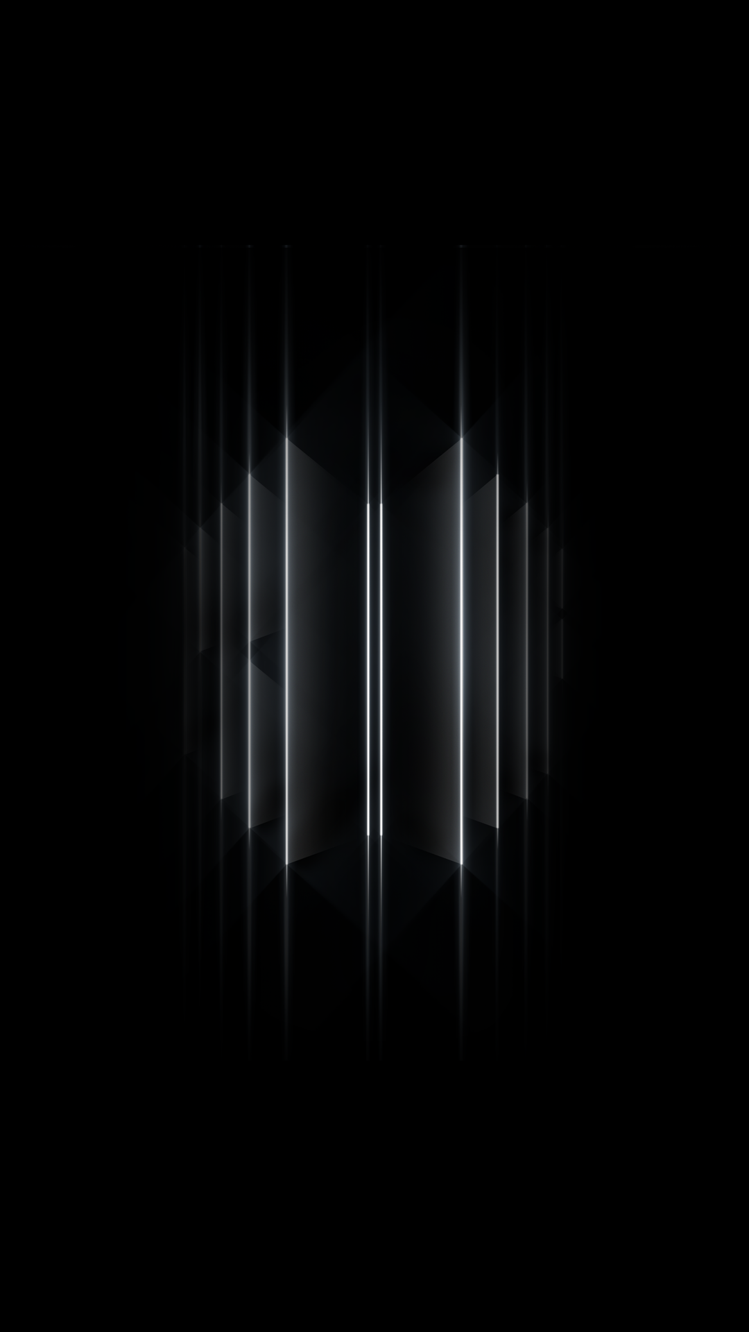


'RedTie' is a concierge group that identifies and resolves various business-related challenges. FLAKE collaborated on the corporate identity renewal project, covering the entire process of establishing the company's identity, from verbal identity work that redefined core values to visual identity including the logo, symbol, and key visual, and applied design. The key visual, combining the alphabet 'X' symbolizing the company's core value of solving everything necessary for business from A to Z and its infinite potential, and the 'bow tie' shape, was developed to clearly express the company's identity.
레드타이'는 비즈니스에 필요한 다양한 문제점을 발견하고 해결하는 컨시어지 그룹입니다. 플레이크는 기업 아이덴티티 리뉴얼 프로젝트에 참여하여 핵심 가치를 재정립하는 버벌 아이덴티티 작업부터 로고, 심볼, 키비주얼을 포함하는 비주얼 아이덴티티, 그리고 실제 적용될 응용 디자인까지 기업 정체성을 구축하는 전 과정에 걸쳐 협업했습니다. 비즈니스에 필요한 모든 것을 A부터 Z까지 해결한다는 기업의 핵심 가치와 무한한 가능성을 상징하는 알파벳 'X', 그리고 '보타이' 형태를 결합한 키비주얼을 개발하여 기업의 정체성을 명확하게 표현했습니다.
Discipline Corporation Identity, Experience
Client REDTIE
Scope Market Analysis, Trend Analysis, Strategy, Concept, Logo, Symbol, Color Scheme & Usage, Typeface & Usage, Application, Appicon, Key-Visual, LogoMotion, Webpage, Guidelines
Client REDTIE